Counseling Center Branding: How Color and Font Psychology Build Client Trust
First impressions shape rapport before the first session. Learn how strategic color, typography, and white space signal safety and clinical credibility.
Key takeaway
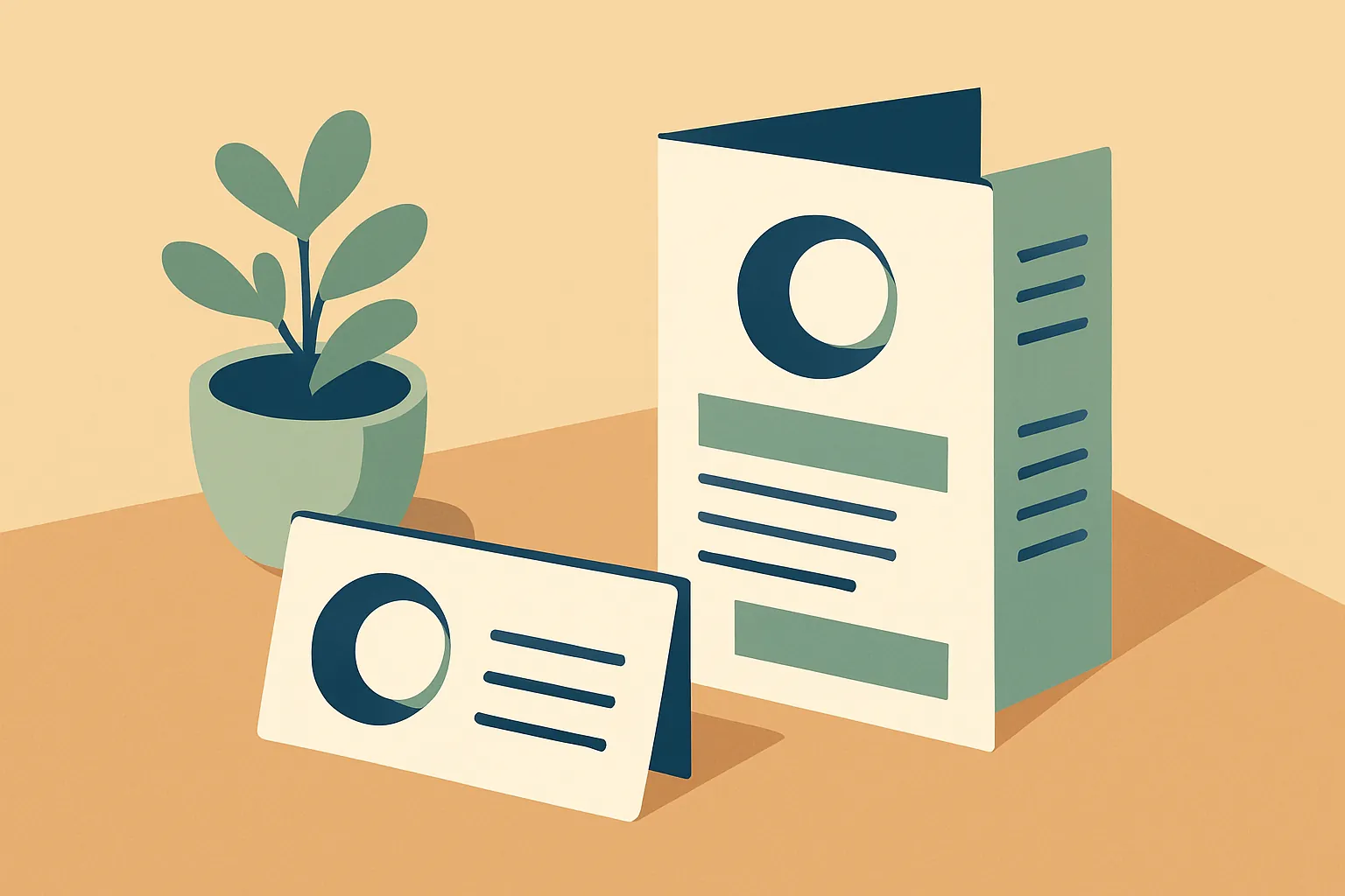
A counseling center's business card or brochure is often the first touchpoint that shapes rapport — well before a client ever sits down. Because of the primacy effect, cluttered layouts and jarring color choices can unconsciously trigger a 'this place isn't professional' defense, while calm, well-organized visuals nonverbally communicate psychological safety. Blues and greens that evoke trust, fonts matched to your center's clinical identity, and generous white space that lowers cognitive load are the core elements that build trust in counseling marketing materials.
Rapport Begins Before the Office Door
Do you assume the therapeutic relationship starts the moment a client walks into your office? Clinically speaking, the first shoots of rapport break ground much earlier — in the instant a client takes your business card or picks up your center's brochure. Many of us invest enormous energy in training and clinical hours, yet treat our marketing materials as an afterthought: as long as the information is there, it's fine. That instinct quietly undercuts the work.
The primacy effect — our tendency to weight first impressions disproportionately — plays a decisive role in setting a client's expectations for treatment. A cluttered layout, hard-to-read type, or an anxiety-provoking color scheme can unconsciously activate a defensive read: this place may not be professional. The reverse is also true. Clean, intentional visual design offers a sense of psychological steadiness and nonverbally communicates one message above all: you are entering a safe space. What follows is a practitioner's (and a center owner's) guide to the color and font psychology that earns trust.
1. Color Psychology: Speaking Directly to the Client's Nervous System
Color is more than visual information — it acts directly on emotion and physiology. A counseling center's materials should strategically use colors that lower arousal and help engage the parasympathetic nervous system, the body's rest-and-restore state. The key is restraint: muted, desaturated tones read as calm, while intense primary colors can read as agitation.
Blues and Greens: The Palette of Trust and Stability
Clinically, blue tends to lower heart rate and cue calm, which is why it so reliably signals competence and trust. Deeper navy conveys authority and depth; soft pastel blues convey openness and acceptance. Greens evoke healing, growth, and balance, offering an easy sense of psychological comfort. One caution: a very cool, clinical blue can feel distant — temper it with warm gray or beige to keep the overall feeling human.
Beige and Warm Gray: The Color of Acceptance
These are arguably the best colors for visualizing the core counseling values of acceptance and empathy. A stark white background can feel as cold and sterile as a hospital corridor; swapping it for off-white or a soft beige instantly reads as warmer and more welcoming. That subtle shift is remarkably effective at lowering a client's guard.
Colors to Use Sparingly: Red and Black
Red is read by the brain as a warning or threat signal and can activate the amygdala — best reserved for small accents, never dominant fields. Black is essential for body text, but used heavily as a background or primary color it can feel heavy or even depressive. Handle both with intention.
2. Font Psychology: Type Sets Your Tone of Voice
If the words on your brochure are your verbal message, the typeface is the tone and inflection of the voice delivering it. Serif and sans-serif type leave entirely different psychological impressions. Whether your center's identity leans toward tradition and authority or modern, approachable care should drive the choice.
| Type | Feel | Psychological Effect | Best Used For |
|---|---|---|---|
| Serif e.g., Georgia, Times New Roman | Classic, serious, elegant, scholarly | Implies long tradition and seasoned expertise; reinforces clinical authority. Signals "I will listen with gravity and depth." | Logos and taglines for adult, psychodynamic, or couples counseling centers |
| Sans-serif e.g., Inter, Helvetica | Modern, clean, clear, approachable | A logical, lucid impression — the sense that tangled feelings can be sorted out. Lowers the barrier to entry and suggests practical solutions. | Body copy for adolescent counseling, CBT, coaching, and corporate services |
| Script / Calligraphy e.g., Lato Italic | Emotional, human, soft | Emphasizes the counselor's warmth and humanity — a heartfelt conversation rather than a clinical procedure. | Child counseling, art therapy, and emotive headlines (avoid for body text) |
3. Readability and White Space: A Design That Lets People Breathe
Just as a skilled counselor tolerates silence and waits, good design needs white space. The urge to convey everything can lead to brochures packed wall-to-wall with text — which imposes cognitive load and ironically drives clients to avoid the information entirely. White space functions as a visual metaphor: here, you are allowed to breathe.
Establish a Visual Hierarchy
Not everything can be equally important. Guide the eye in a deliberate order: center name/logo → core tagline → primary services → contact/location. Set the most important message in bold and large type, and secondary detail in smaller, lighter type, so clients grasp the essentials intuitively.
Use Photography and Icons That Build Credibility
The stiff stock photo of an implausibly cheerful model does less than you'd think. Warm lighting in your actual office, a comfortable couch, or a profile photo of you with a gentle, genuine smile inspires far more trust. These images let a prospective client simulate the visit in advance, lowering the psychological threshold to walking in. For complex techniques, replace dense paragraphs with clean pictograms to keep things legible.
Conclusion: Design Is Care, Made Visible
Your business card and brochure are not merely marketing tools. They are the first handshake you extend to someone who needs help — an invitation to a journey of healing. Through trust-building blues and greens, a balance of readable sans-serif and dignified serif type, and white space that lets people breathe, you can make your expertise and your warmth visible. Polished design plants an unconscious belief: if it's this place, even my tangled mind might find some order.
Of course, juggling clinical work, center operations, administration, and design is genuinely hard. But if you can ease the weight of documentation and admin, you free up energy for creative work like branding. Many centers are now adopting AI-assisted session transcription and progress-note automation for exactly this reason. Hand the repetitive, draining record-keeping to tools built for accuracy, and reinvest that time in a better environment for your clients and a more thoughtful brand. The change in a single business card can make every first meeting that much deeper. This is where a security-first AI partner like Modalia AI fits — handling transcription, case conceptualization support, and documentation so you can focus on the human work.
Frequently asked questions
What colors work best for counseling center branding?
Blues and greens are the strongest choices — blue lowers arousal and signals competence and trust, while green evokes healing, growth, and balance. Pair them with warm neutrals like beige or warm gray to stay welcoming rather than clinical, and use off-white instead of stark white backgrounds. Reserve red for small accents and avoid heavy black fields.
Should a therapy practice use serif or sans-serif fonts?
It depends on your identity. Serif fonts (e.g., Georgia, Times New Roman) convey tradition, depth, and clinical authority — fitting for adult, psychodynamic, or couples work. Sans-serif fonts (e.g., Inter, Helvetica) feel modern, clear, and approachable — better for adolescent counseling, CBT, coaching, or corporate services. Reserve script faces for emotive headlines, never body text.
Why does white space matter in counseling marketing materials?
Generous white space lowers cognitive load and makes information easier to absorb. Densely packed text overwhelms readers and prompts avoidance, whereas open layouts act as a visual cue that the space is calm and safe — mirroring the way a counselor holds space and tolerates silence.
How can a counseling center find time for branding?
Administrative and documentation work consumes the energy that creative branding requires. Automating session transcription and progress notes with a security-first AI tool reclaims that time, letting clinicians reinvest it in client environment and thoughtful design.
This article was written and reviewed using Modalia AI's clinical guidelines, with professional human review before publication.
Related articles
 Clinical Skills
How to Write Better Supervision Questions: Getting What You Actually Need from Your Supervisor
Stuck on what to ask in supervision? Use these structured question strategies to turn vague check-ins into focused clinical insight.
7 min read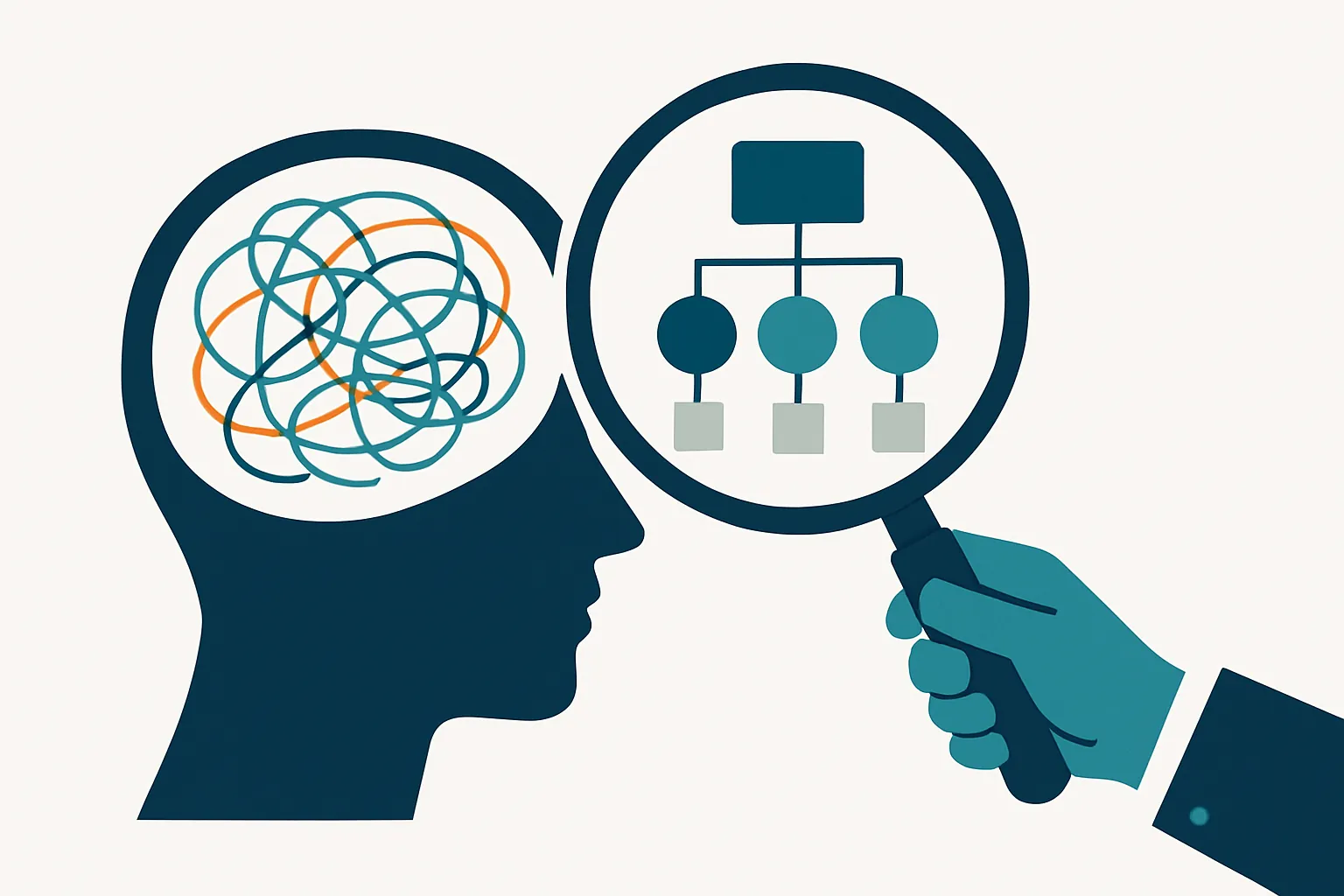 Clinical Skills
From "The Client Seems Depressed" to a Clinical Hypothesis: How Word Choice Elevates Your Case Reports
Turn vague observations into precise clinical hypotheses. A practical guide to terminology and sentence formulas that make your case reports read like expert work.
7 min read Clinical Skills
The Wounded Healer Trap: Why "I Want to Heal Myself" Sinks Your Counseling Grad School SOP
Why admissions faculty flinch at "I want to heal my own wounds"—and how to transform personal pain into a research-grade statement of purpose that gets you in.
6 min read